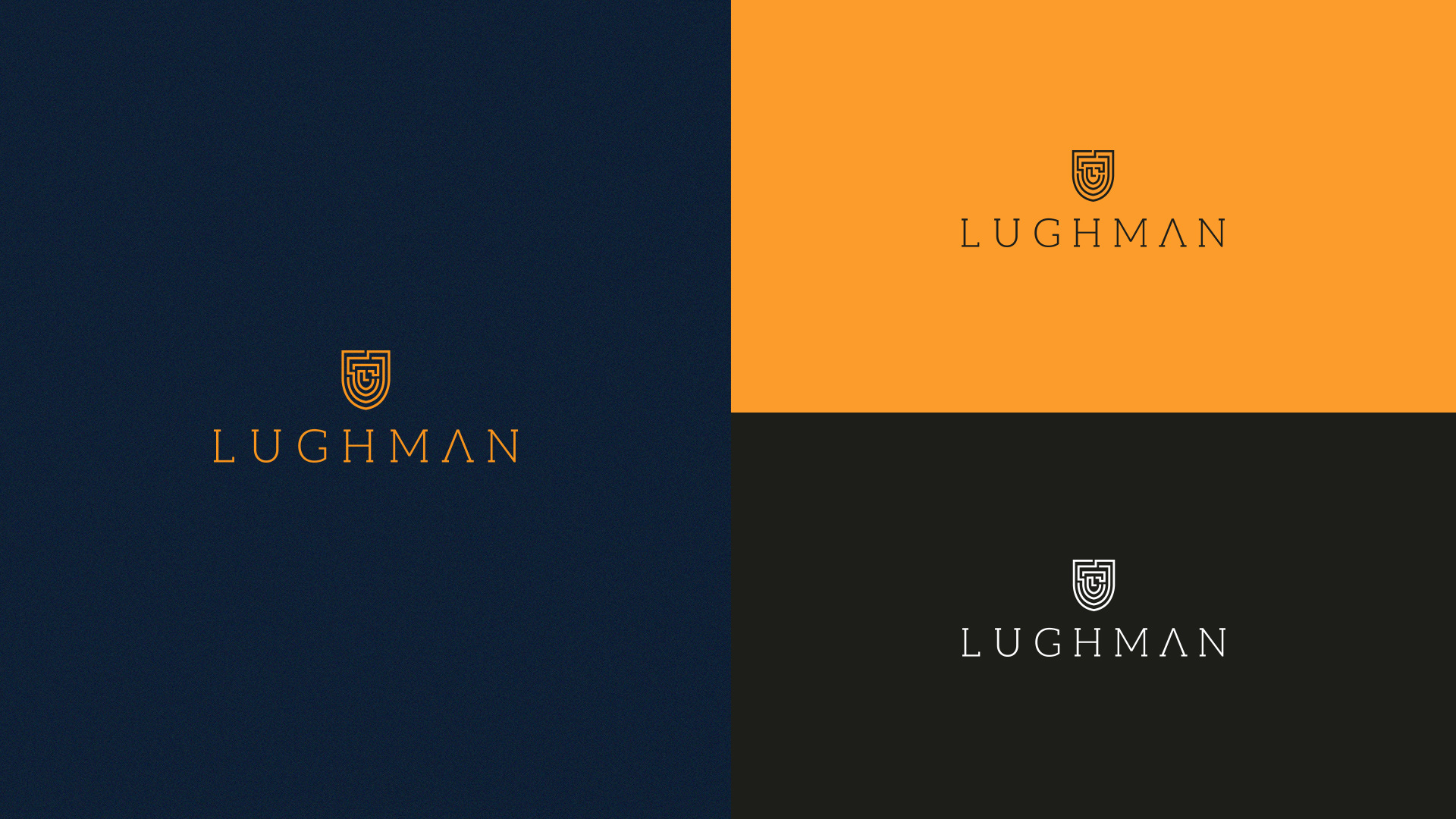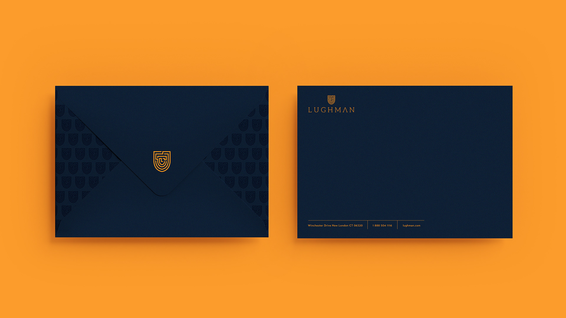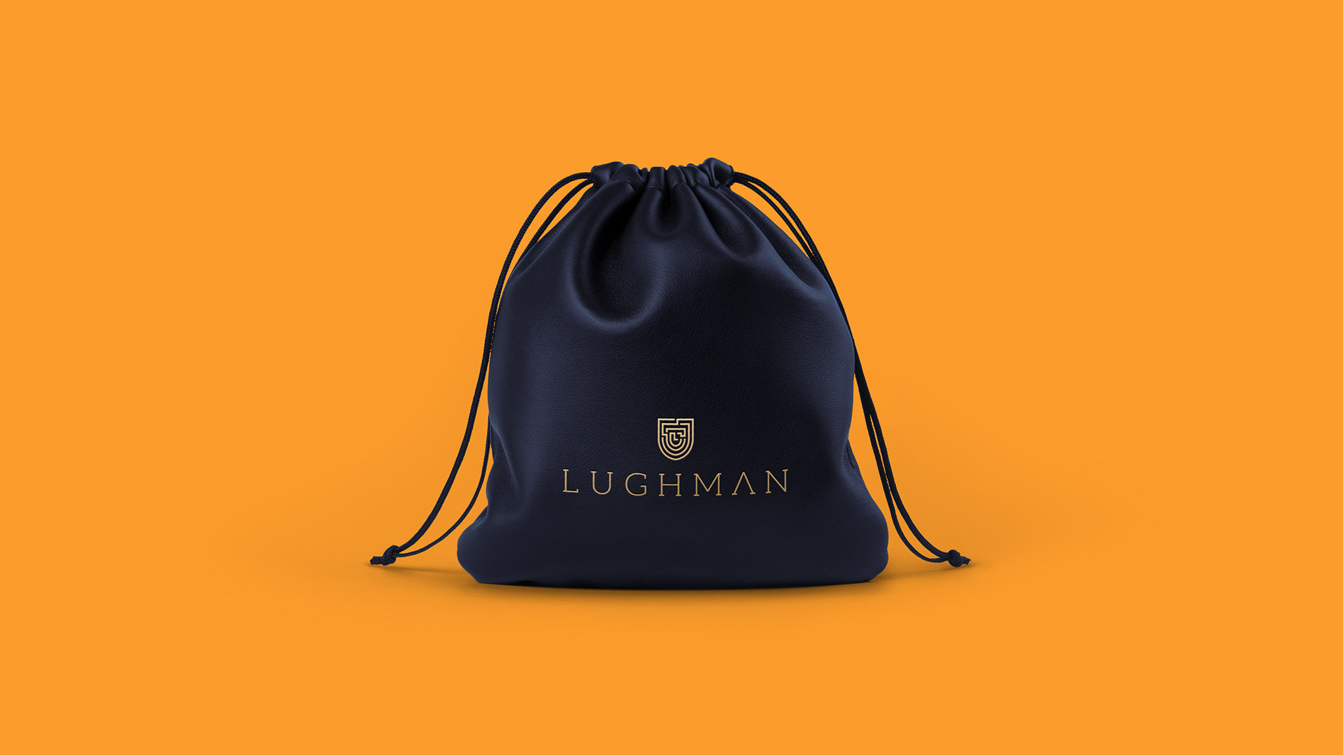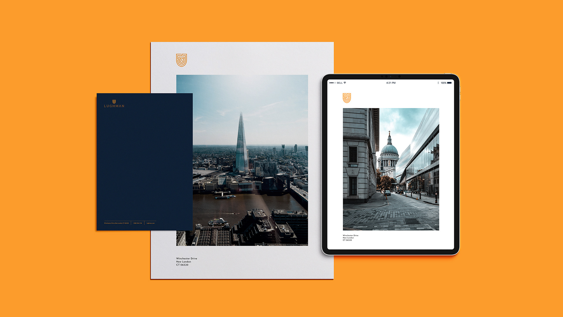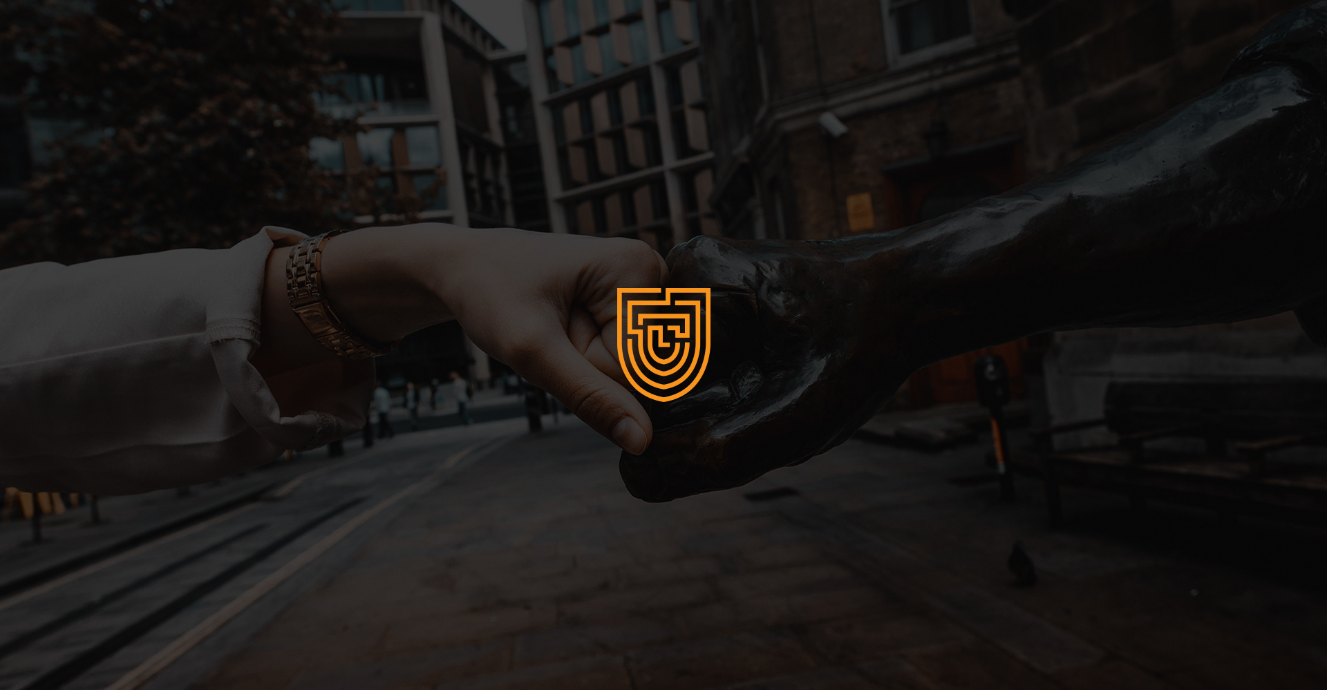

Lughman is a national consumer goods company in the UK. We wanted the main design to reflect that.
At its core, the logo is simple and smooth. We designed it for inclusively and connective.
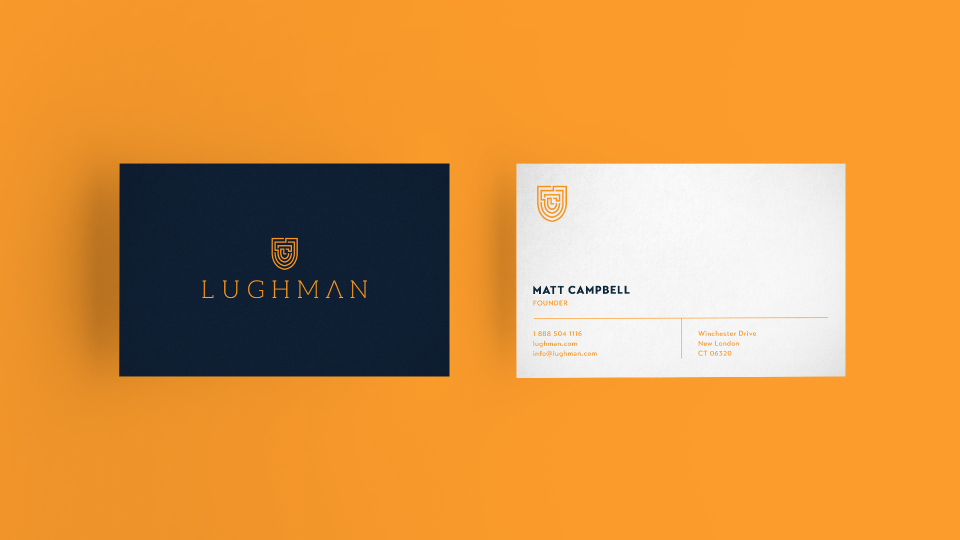
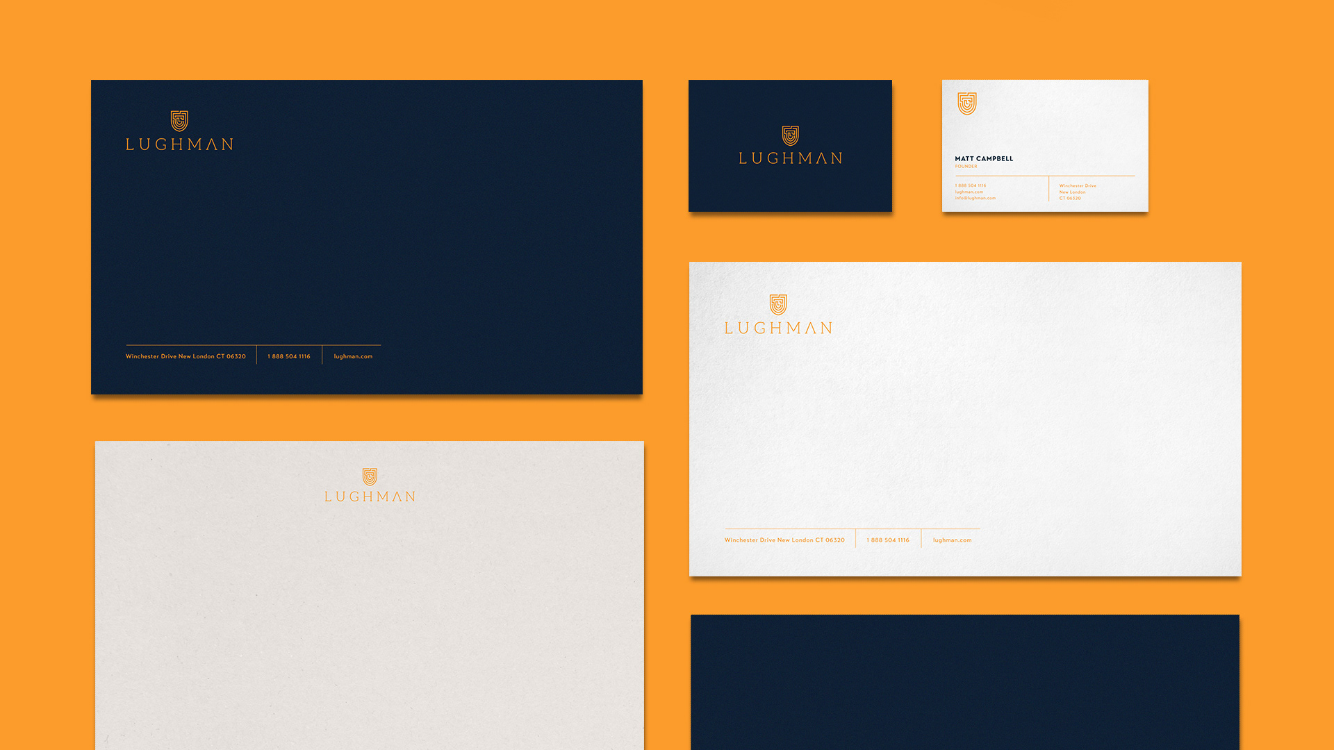
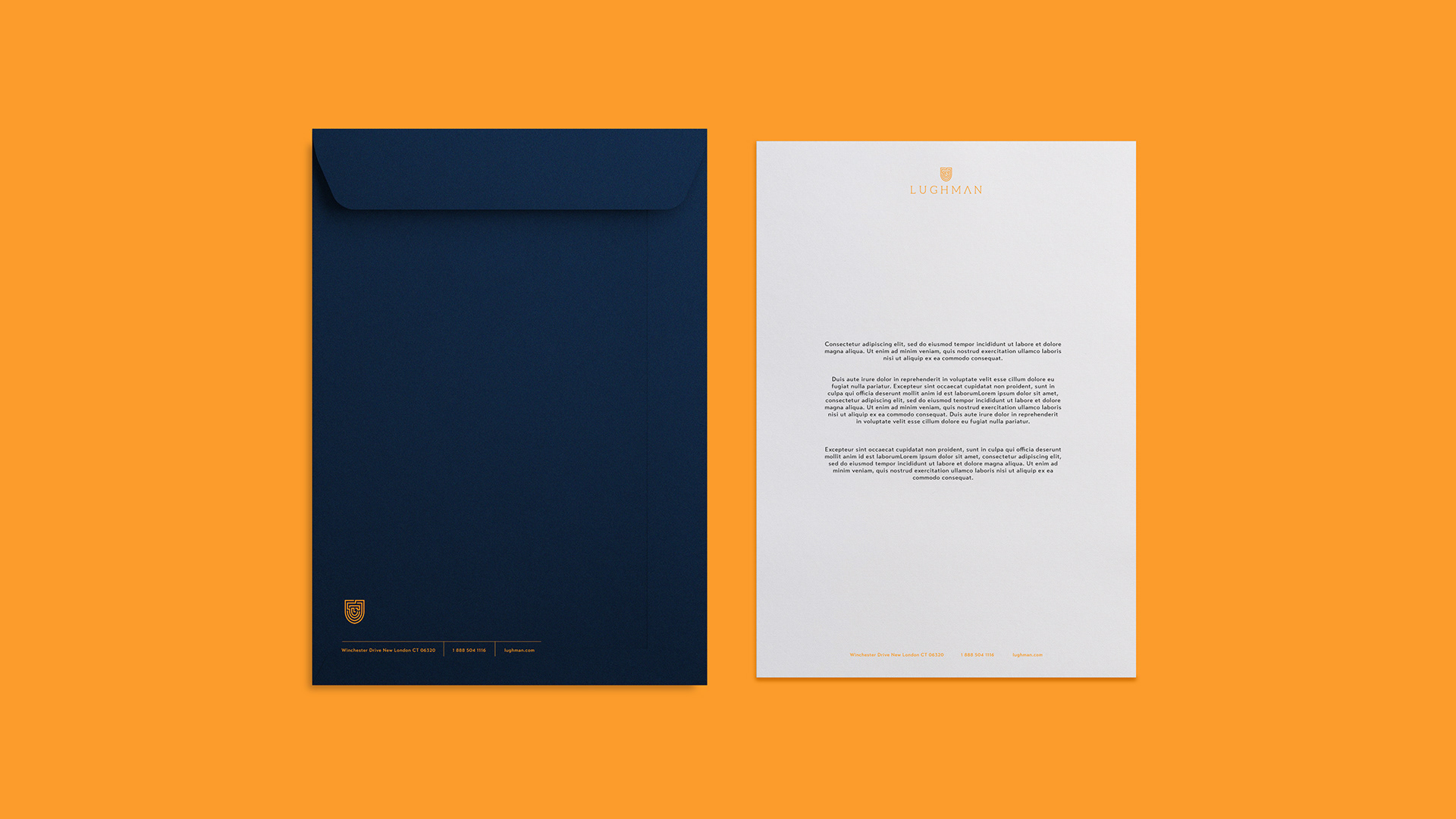
For this guideline, we will be focusing on 3 elements: colour, logo and type.
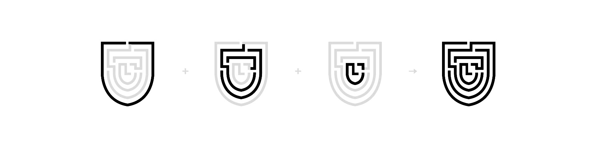
The shield symbolises power, protection and gathering.
The maze-like lines centering around the Letter L, which stands for Lughman, represent the sub-brands.
The lines that form a shield while also resembling human faces, highlight the brand’s people-orientedness.
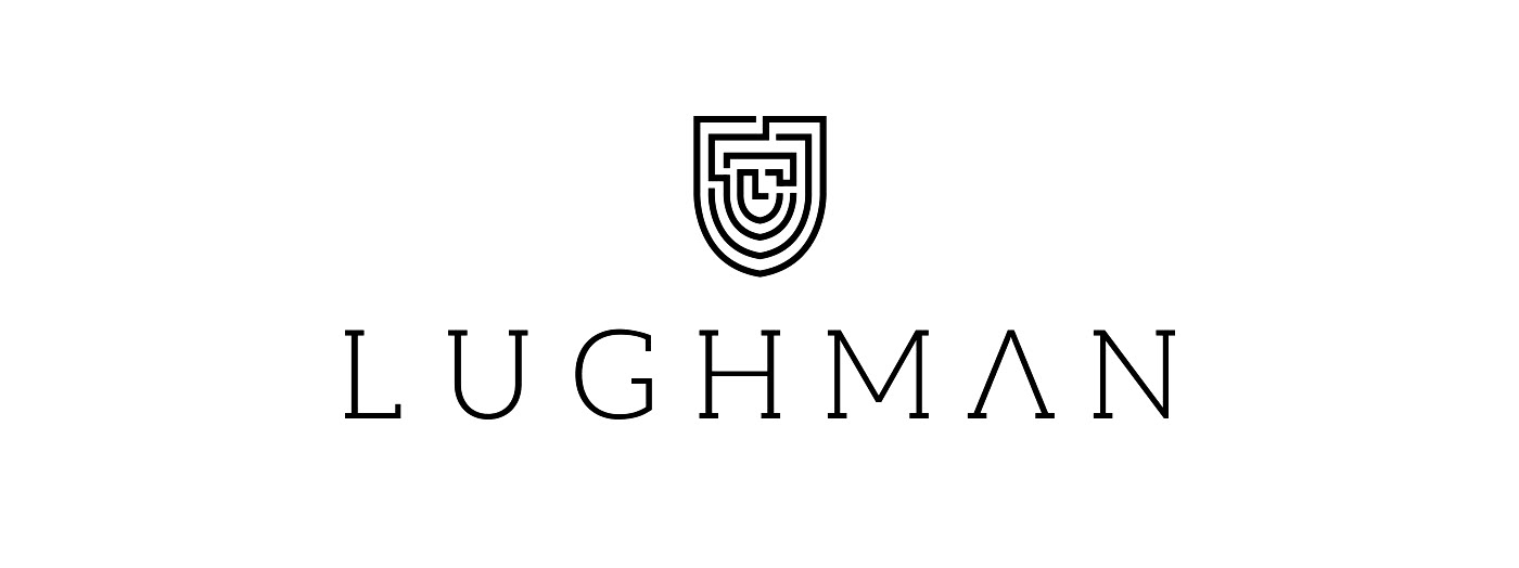
A bespoke typeface, the thickness and kerning of which were specially scaled and adjusted to
intensify the sense of uniqueness and elegance the brand creates, was used for the logo.
The serif-style typeface is intended to create a grounded impression while its sharp edges add to its earnestness.